Improving the Archive: part 1

I have several goals for DIGIT 496, but most of them are connected by one thread: the arrowarchive.
Over time, I have noticed several things, but I never knew how to fix them. This study is an opportunity to learn how to fix the issues I'm aware of and more. The sidebar has most of them, but entries will be added for those topics later. For now, I want to focus on something I have witnessed, but want to integrate into my website: image scaling.
The scale of my art always changes; some are portrait, some are landscape. Some are the size of a postcard, while others are the size of posters in a movie theater. The point is, whenever I add an image to the website, I have to go to the properties and scale it down so it fits my screens (1920 x 1080 and/or 1600 x 900.) Meaning, the images are scaled to fit my view, but leave empty space on larger screens. I saw a possible solution to this issue, but I want to test it first.
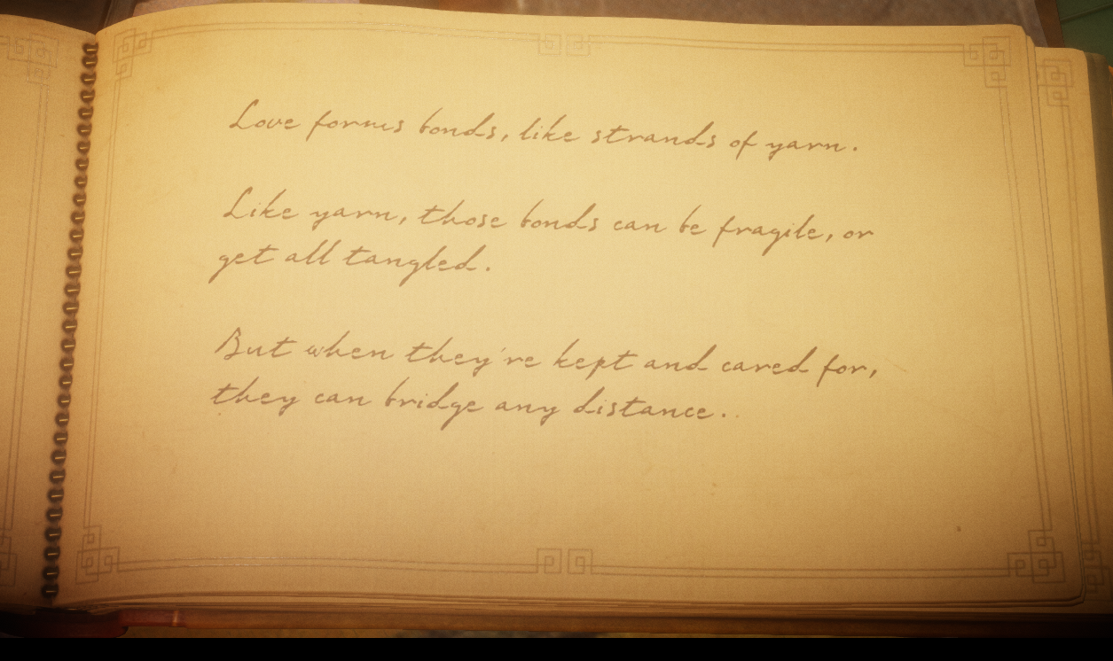
In DIGIT 110, I worked on a group project using XSLT, and special code was added to the CSS to scale the images in accordance with the monitor size. I want to test that code here (or variations of it) and implement it into the archive. Most of my art tends to cross the 2000px threshold, so to start I have a screenshot from Unravel, one of my favorite games of all time. It will appear large on my monitors, but small on others. When this scales, I'll add my artwork for testing purposes. If all goes well, this will be a massive timesaver.
Side note: I'm in a bit of a catch 22 here as well: if I don't hard code the image value, the sidebar takes up the whole screen. If I hard code it, it appears smaller on every device. This is gonna be a balancing act...
-Rachel
